Monday 29 October 2012

Op Art

This is a selection of art that in inspires me Op art. M.C Escher can be considered the father of Op art. His lithographs,woodcuts, impossible constructions often mathematically inspired mixing infinity with architecture
 and his love of Roman and Italian landscapes ( I lived in the same street where his house was in Italy) while incorporating three dimensional elements to his work I have always found highly innovative for his time.


The Escher Museum in the Hague, The Netherlands. I Have been there twice recently. The Museum is housed in the Lounge Voorhout Palace from the eighteenth century and has an air of grandour with 15 chandeliers made by Dutch artist Hans Van Bentem. They have a really good selection of Escher's work including unseen pieces like the Asteroid.


By keenly confronting the enigmas that surround us, and by considering and analysing the observations that I have made, I ended up in the domain of mathematics. Although I am absolutely without training in the exact sciences, I often seem to have more in common with mathematicians than with my fellow artists.
– M.C. Escher (from To Infinity and Beyond, Eli Maor)
Another artist that uses op art in a contemporary way using algorithms/systems with a sense of depth in his work is the American Artist/programmer Dave Bollinger http://www.dataisnature.com/?p=364
While here in London I saw the work of Bridget Riley she was the celebrity Op Artist in the 1960's creating abstract geometric movement. She initially was making them in black and white but then moved to colour adding straight lines or waves creating an illusion of movement. This latest one is the art work I saw in the summer at The Royal Academy in London


The mid- 1980s Bridget Riley’s work move away from a build up of sensation and instead she went towards an art of pure visual sensation, treating form and colour as ‘ultimate identities’, as things in themselves. Units of colour were arranged according to principles of relation and chromatic interaction.


I have always been interested in the links between Op Art and the Bauhaus the Famous German school created by Walter Gropius and Frank Stella (originally Italian).


Frank Stella considered painting more as an object rather then a representation of something. With his asymmetrical irregular polygons he was exploring the tension between colour, the flat form of the canvas and optical effects of the two. The colours are stark and vibrant he moved the painting in away so to enter the viewers space.


Kenneth Noland circle and target paintings where one discovers that the edges of the canvases are as important as the centre. He used to stain the canvas with colours instead of using brushes I find this very interesting for my own work as I am not a keen user of brushes but also it emphasise the importance of the art work the actual piece instead of the artist I generally use a knife or a palette but I am definitely going to experiment with other methods. Colours are prominent in his work.

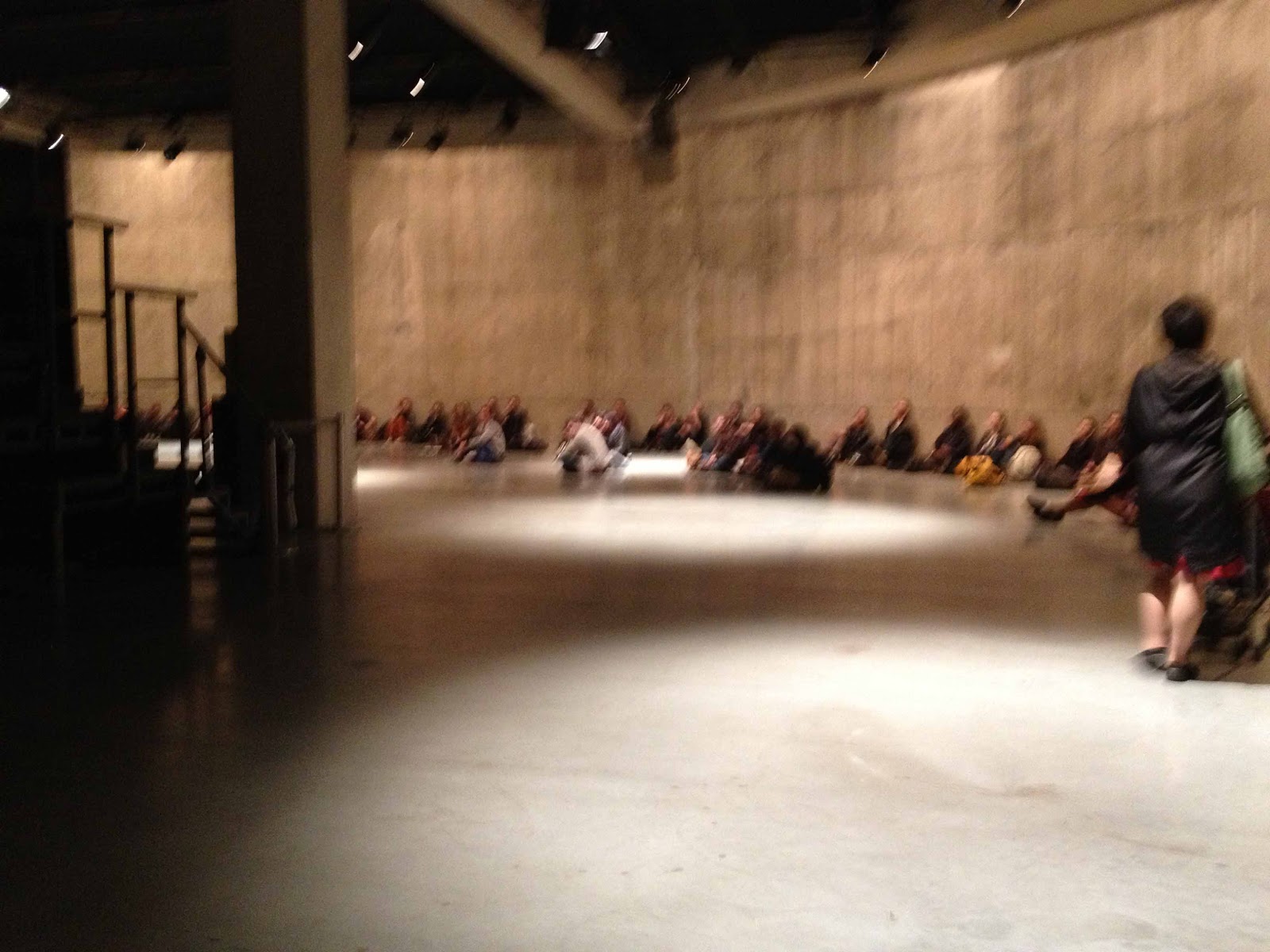
The last artist on my list today about Op Art  and his different uses, methods is the Japanese Artist  Yayoi Kusama. I have seen her work for the first time at the Tate Modern rooms filled  with obsessively repeated  colourful polka dots one is no longer looking at a painting but is part of an infinity of dots bursting with energy. I admire the fact that she keeps making her art work & doesn't stop even if she is in hospital. It must have been a real shock for her to move from liberal New York to conservative Japan I really do relate to the challenges of moving from one culture to another. I found that the exhibition at the Tate Modern was  well curated  as it had a good variety of her work on show.
This is one of her sculptural works I enjoy the physicality of the piece which is given by the repetitive use of phallic protrusions going in different directions made in monochrome colour.

Friday 26 October 2012

Timothy Taylor Gallery: Kiki Smith


Exhibition of Kiki Smith at the Timothy Taylor Gallery in Mayfair. The work on display was two dimensional, pleasing to the eye  like for example the Blue Moon piece below but I felt it lacked depth it seemed a bit light. The woven piece on the left was technically impressive  and it shows a keen interest of the artist for narrative, storytelling, myth, the natural world (eagles, stars, moon are subjects of her work). But over all I felt that pieces like Mary Magdalen that was not shown at the gallery as it's not part of her recent work carries a stronger content her feminist views better then the current work on display.
About the Timothy Taylor Gallery it's an upmarket Gallery in one of the most expensive areas in London, Mayfair.

Sadie Coles Raymond Pettibon


 In The Sadie Coles Gallery in Mayfair I saw the exhibition of Raymond Pettibon: comic like drawings, collages made with Indian ink with a stark effect black and white. His drawings, collages are filled with a variety of characters male and female (semi naked) & ironic text criticising American mainstream culture (Hollywood, fame etc) with an anti-authoritarian and anti-establishment feel to them. They are very different from traditional comics due to the aggressive content of his work and also that's why his work feels so contemporary. Looking at my own comics I found interesting that he makes large comic like drawings I think I should bring this element into my work not to make it restricted to one format, make it bigger and experiment with blank ink as well.
I have seen his work before at the Hayward Gallery and I feel that his work stood out more at the Hayward Gallery, where it had been better curated they only chose a limited selection of his work and it was mixed with other art work of a different variety from other artists. In Sadie Coles both the up stair Gallery space and the basement space have been filled with his work and I found it after a while it got repetitive and kind  of lost meaning there was to much of  it on display and I felt this weakened the 'punk rock' aggressive content of his art work which is a pity. I think they should have mix it with other more colourful type of his art work.
About Sadie Coles in Mayfair is an upmarket gallery and if we compare it  with White Cube in Bermondsey with out the glamour effect but situated  in one of the most expensive areas (Mayfair) in London. We had to ring a bell to get in, the gallery assistant was brief  & gave us a leaflet about the gallery.

Wednesday 24 October 2012

Thomas Schutte at The Serpentine Gallery

The Serpentine Gallery  locaded in Kensington Gardens in Hyde Park in tranquil beautiful surroundings and they exhibit contemporary art. Unfortunately they didn't have a cafe' I think a new pavilion might be build soon to house a cafe maybe for the Christmas. One can not sit around in the galleries either and I didn't find members of staff friendly I was told not to take pictures and I wasn't even inside the main gallery.

I went and see the exhibition by Thomas Schutte I found that his sculptural pieces worked better that his watercolours. The sculpture pieces  had a physicality to them that it seemed lacking in the watercolours.One of the sculptural piece called the Father State located in the centre of the gallery  was a  tall  rusting steel, detailed and imposing,  representing political leaders and their hollowness(the gown looked bodiless underneath) it was surrounded by photographs of angry, hurt faces reflecting on the persecution of repressive regimes. All the sculptures on display where figurative and he seems to have keen interest in the portrayal of power but then to make a caricature out of them by exaggerating physical features and facial gestures.
The watercolours portraits made in series  where made with minimalist simple lines so I could not distinguish between one portrait and the other they all looked the same so I didn't feel I could engage longer with them as there was really nothing to hold on to visually they seemed more like preparatory drawings then finish pieces even if they where presented as finish pieces. 
Also I was wondering if the only self portrait in the gallery of the artist was done in a quick way just for the gallery it looked unfinished and simplistic (check below) but lacking of a substantial meaning for being so simplistic same with the watercolours thought they looked good on the catalogue as they had been photographed at really close range. I could not distinguish one portrait from the other while standing in the gallery.While I was looking at them I was thinking what's the point of making portraits of your friends if you make them look the same he could have just done one?!

Tate Modern -Tate Tanks

                                                                                   
Tate Modern opened in 2000 with the opening of Tate Modern the whole area went through a great period renovation & regeneration with new buildings being built. A new Addition to the Tate it's Tate Tanks that looks like an underground bunker for the arts supported by huge concrete pillars


Tate Tanks it's a new space inside the Tate Modern for performance films & events also called art in  action on the day I went they where showing  Sung Hwan Kim. Sung Hwan Kim is a Korean artist that works with video & performance. His work is about storytelling & he plays multiple roles. 


 I was happy to see Aldo Tambellini's experimental filmmaking great space to see it as well the space was vast.
He turns videos into moving aerial paintings.


by AldoTambellini

america made my brother
a total stranger
the unwritten law
divide & conquer
no conquests were made
but it created 2 remote
spaces
where blood from the same blood
splits its cells
each in its own container
separated completely
yet he’s only four years older
born under the same taurus sign
same mother same father
in the same city same land
in america
both taken to another land
italy
we grew up together with mother
yet a century separating us
during war we shared the same
bombing
he inside the house
I laying face down on the street
people we both knew died
I was the incorrigible one
he was the studious one
went along with the time
I the wild one
who often without knowing why
rebelled
each had his private war
art was in my blood from the beginning
he graduated in business administration
I faced the crisis at home
he did not
if I saw him right now
on the other side of the street
it would hurt me deeply to say
there goes my brother
america made him
a total stranger October 15, 1990


This is the space where his films where shown like a contemporary version on an ancient Greek Amphitheatre designed by Herzog.


Monday 22 October 2012

Jerwood Space


In seriously bad weather I decided to then go up to the Jerwood Space to see the Jerwood drawing Prize which is the biggest drawing exhibition in the country. There was a wide variety of drawings that streched the boundaries of what traditionally a drawing is considered to be like for example Katy Sheperd's stop motion animation of a dying crow or Richard Galloways nightmarish city.
I also discovered that they are also one of the best rehearsal spaces for dance & theatre in the country (one member of staff told me) I was shown one rehearsal studio which was light, airy. They are basically an educational institution & they have a cafe' overlooking a nice courtyard all geared towards the public, a friendy welcoming space.

Tuesday 16 October 2012

The Drawing Room in Bermonsdey


The Drawing Room it's located in an industrial estate ( this kind of gives away it's a non-profit public gallery that shows contemporary drawings). I had  to ring a bell to get in , it's not well signed posted. I did find it a bit hard to find at first but It was worth it when I finally got there as the lady running the gallery was warm friendly informative she encouraged me to look around and ask questions  completely different atmosphere from White Cube more intimate & welcoming.
So I didn't feel the building the estate impacted badly on the Gallery I guess they are there to keep gallery costs down.The exhibition


 Paul Sietsema explores how imagery and material affects our understanding of culture. He makes drawings, sculptures & then films them. He compares the original image with ideas. On the left four series of Sailboat drawings Calendar boat 1,2,3 and 4 that he duplicated and made the image in reverse. Their repeated frames made me think of stasis which can be found in structuralist films. He doesn't do completed sketches  but instead he looks at the relationship between material, form and imagery and then he adds film to pull things together such as Telegraph 2012.

White Cube Gallery in Bermondsey London

After I indulged in cheese, wine and fresh gnocchi from Borough Market I decided to go an check out the new White Cube Gallery in Bermondsey which is enclosed in a gated compound. I have been shocked at how big, modern and sleek it is then the Hoxton Gallery but with a glamour element. I felt they made a great use of the space considering that it was a 1970 warehouse but that it is geared for the time being more towards wealthy clients business ( I saw some private rooms) & a young audience then being an educational organisation. There is a library which made me think they will eventually go towards promoting educational events but I think if they want people to hang around they need to put some seating space  in the exhibition rooms and a cafe'. Also the stuff needs to be more involved with the public as they seem more involved with themselves then the public. When I went inside the gallery I was not greeted by anybody, the same in the exhibition rooms. The galleries seem to be mainly staffed by male art graduates I didn't see anyone from a minority or a local and the only woman there was was the lady in reception maybe I went on the wrong day I don't know...
The exhibition I saw was on the cerebral side titled Structure and Absence which included Andreas Gurky- Gabriel Orozco-Robert Ryman. I think White Cube definitely ads a glamour element & more art to Bermondsey & to London but I am not sure how much the locals who live in the council flats near the gallery will even know or enjoy the space. It's like the tale of two London's the successful, wealthy business venture and the poor who can't afford much.

Borough Market


Borough Market is located near London Bridge in a busy spot ideal for traders as lots of people go by the area. It is surrounded by a variety of of new buildings like the Shard and old buildings like Southwark Cathedral.

While I was going around Borough Market I saw a large stall selling mushrooms lots of people where buying big bags filled with mushrooms which made me think of old fashioned open markets in France or Italy. The stall was located in the old side of Borough Market.


Borough Market is been able through the years to retain an artisan character selling both British and International foods below it's the old side of Borough Market which I really like where they sell fresh vegetables.


 and wine, olive oil.