Wednesday, 27 November 2013

Calvert 22 Gallery: Russian & Eastern European Art.

Today I went with my Territory of Practise group to visit Calvert 22 Gallery/Foundation in the East End to view the exhibition Dear Art curated by 4 women which had a definitive political theme. I have never been around in this particular area and I was surprised to find how funky, arty the area was with galleries cafes I mean really trendy.


Calvert 22 Gallery is a non profit Foundation that promotes Russian & Eastern European Contemporary Art thought in the exhibition there where two Italian Artist Rossella Biscotti (her surname means biscuits) & Cesare Pitroiusti. The space inside was minimalist modern with a red wooden table, bench and there blocks surrounded by books, magazines on Russian and Eastern European conceptual artist and a mini bar inside the gallery one could sit and I also noticed the stuff was allowed to sit as well (in  a lot of galleries this is not possible) which I thought was good they have a downstairs space as well where there was a film on show. The artists in the exhibition show different ways of dealing with political activism some are up front others more subtle in their approach but they have in common the fact that political issues, activism and show that it can be explored in different ways and still engage  the audience.
I watched the video titled The Emperor is Naked 2013 by artist Marina Naprushkina from Belarus who now lives in Berlin.

 In the video one can see her running through the snow while she speaks about becoming politically active in her art work after some of her family, friends where persecuted in Belarus so she was explaining how can a piece of political engaged art work can bring change in a country where they don't have democracy and civil rights ( her words). In the video she also says that for her it's better to be politically active in the street then on the Internet as it is less dangerous and more personal. She was explaining that on the street one can discuss with people who stop to chat to her about her ideas/cause and she can bring change in the way they think in a more direct way ( she is shown in the video holding a piece of art board like one would do in a protest. In the video she also talks about capitalism and how Germany is been benefiting in being competitive within the Euro zone and failed to have more outright Utopian ideal of living then brought into practise which I thought was unfair as one can not blame the Germans for being more efficient then others in the European Union there are other countries and if they are in the EU is because the governments of each Eu country feels that's the right choice ( I don't agree with this I think the EU is a mess) and if they don't oppose to legislation's put forward by Germany they then can not blame all of it on Germany each EU country should take responsibility for their own situation at the same time the undemocratic way the EU has been set up will eventually bring it to it's own collapse. Anyway the art work  by Marina Naprushkina is thought provoking and it makes you think about the role of art and of the artist within society and how one can be politically active in an artistic way: in a positive way and bring change in the way of thinking and within society so  in her art work art  is used a means to change and it's thought provoking.
Then there is the work of  Turkish artist Halil Altindere three hand made gold necklaces with in scripted 'I 'd rather have roses on my table than diamonds' on my neck then the second necklace is got unscripted 'If I can't dance it's not my revolution' and in the third necklace my favourite it said: 'Women need not always to keep their mouths shut and their wombs open' which are about women's right, freedoms their right for self determination  and she focuses your attention on the actual words by the statement  being funny & true so in her  work written words contain a political message. Apparently the proverbs in her necklaces have been taken from sentences by a pioneer peace activist and anarchist and a feminist so by famous public figures.

While the artwork 'Bread and Cake' is a more subtle way of dealing with the political.  Mladen Stilinovic from Belgrade by associating bread with cake is relating two different class systems the poor and the wealthy so the work is about the class systems and also implies labour, the relationship between power the people at the top and the once at the bottom. Another artist that is less direct in the way he presents political ideas is the German artist Lutz Kruger  who made a video about the 1938 suicide of german painter Ernst Ludwig Kirchner this is one of his painting titled 'Marzella'.


Kirchner was an Expressionist painter considered degenerated by the Nazis his works where destroyed by them if you weren't aware of Kirchner history, the period he lived in & the kind of art he was making the video wouldn't make much sense. Kruger videos his friend who is supposed to represent the painter  Kirchner walking in the mountains and shooting himself again again which to me represents the ultimate annihilation of the individual against the authority in power.


After watching the video I went back to check the work 'Bread & Cake' and I asked the gallery attendant if the bread and cake where changed daily? As it looked fairly fresh it would be interesting to go back in a while to see how well is keeping but he said they don't change it daily like for example in Sarah Lucas work. Then I move on to  Sanja Ivekovic's artistic work which deals with issues of gender and politics in the media and in society. They are large photos of images (you can't missed them)  of what appear to be women in glossy magazines till one realises they actually feature the feminist activist Jana Sarinic practising the gesture of the partisan salute.


 Finally below the work of Cesare Pitroiusti: drawings on paper & Slovenian dark beer so not any beer but Slovenian! His work is about limitation of property and he seems to be concerned with the political but in terms of economics & what is art worth  and he is interested in the relationship of ordinary acts.


Friday, 15 November 2013

Hilma Af Klint the first Abstract artist was a woman.

Recently I have been studying the work of Swedish artist Hilma Af Klint ( 1862-1944) a pioneer in abstract art,  geometric works and large abstract works some inspired by her three spirit guides called Ananda-Amaliel-Gregor. She was interested in human evolution, mathematics and the paranormal. Her  abstract paintings where never shown as part of exhibitions during her life time this is because Hilma Af Klint thought that her generation wasn't ready to accept her work but also I would like to add that she was marginalised by the main stream art world predominantly dominated by men both in terms of art critics and artists I think her being a female artist and mystic in the early 20th century was a brave choice. She was not interested in making money or being famous but in exploring and understanding her place in the world & the universe it self. Her marginalization by the art world also made me think that modern art is really based on the market place: museums, dealers buying your work and establishing the artist and if the artist is not part of the market place then they are 'outside' and ignored by the art world no matter how good or talented.
She was part of a spiritualist group with four other women walled the Five, was influenced by Theosophy ( also founded by a woman H. P. Blavatsky) the first religious organisation in Europe that included women at a senior level, that recognised women on an equal level. She met Rudolph Steiner who didn't understand her work but answered her call (he did not answer Mondrian who was quite upset about it) she was depicting the spiritual world while in trance (she was a medium)  but not all of her work is done in trance and not all of it is geometrical, at the beginning she was working with landscapes & portraits which was quite common in her times. She anticipated the work of artists such as Mondrian (concept of pure colours and forms), Malevich, Kandinsky (concept of synesthesia) her symbology & automatic drawings came much earlier on (30 years) then Surrealism. Both Theosophy and the encounters with Rudolph Steiner inspired her work making it less geometric, less angular precise more loose and huge 11 feet high in fact which make me think more of meditation paintings/abstract art with the use of soft pinks, brunt orange, lilac colours. Some include letters which where meant as a symbolic language for humanity.
She left most of her work to her nephew with instruction they shouldn't be sold or exhibited only after 20 years after her death in her life she only shown her landscape and portraits but she kept secret the other much more important abstract  paintings which preceded the abstract painters of 1910-1913 (Kandisky-Robert Delauney, Kupka & Picasso's Cubist period) and the scale of them ( considering she was a tiny lady) shows as Rebecca Pardrige states in the Berlin Art Link review:
'a female artist with tenacity, one with a sheer disregard for any artistic or gender conventions of the time'.
http://www.berlinartlink.com/2013/07/14/review-outside-is-in-hilma-af-klint/
Her first abstract works where called 'Primordial Chaos 1906-1907' and where a combination of abstract shapes with elements showing cosmic creation nearly 200 paintings followed by the Evolution works they are really colourful abstract works combined with strict geometric forms, circles and oblong shapes then there are the amazing small scale watercolours part of the Parsifal Series with again vibrant colours. 
She was also aware of the book written by two women theosophists  Annie Besant & C. W Leadbeater called 'Thought Forms' which states that thoughts float & radiate. Between 1905-1912 she made paintings called the 'Paintings for the Temple', the Temple is a metaphor for a building that would propel the spiralling movement within her paintings forward uniting each single painting into one so moving the viewer into a higher level of consciousness.
Followed by the Atom Series in 1917 biological mix, complex organism mixed with simple circular shapes.
Her prolific, large scale works definitely challenge male artists in abstract art even if she was working in isolation or with a small group of women in the North of Sweden, being a woman she felt they where supporting her as in her times women where still seen as only good for reproduction and where not taken seriously artistically they where not seen in the arts as capable of introducing a new body of art works e nobody at the time believed that a woman could connect with a high power or guide when painting which makes her life long dedication to her work even more outstanding and I see this as a political stance in itself. Political not in the narrow sense so against past aesthetic traditions & political institutions but political from the fact that spiritual liberation from materialism will bring social revolution.
This ideas where coming from philosophical vitalism (Henry Bergson) & contemporary occultism which in turn where based on the belief that the arts could bring revolution in the way people think, experience, view things in their daily lives. So the role of the artist was from this point of view and as embraced by Hilma af Klint as a 'prophet visionary' that could show the way to humanity towards a new spiritual order this is in turn was an expression of Utopian way of thinking as political ideas at the time where getting mixed with occultism (the two where not seen as different like we do know) by artist's in the early 20th Century in the Northern countries creating new ways of artistic expression & thinking.


Below it's a really good link to learn more about Hilma Af Klint and her work.
http://www.modernamuseet.se/en/Stockholm/Exhibitions/2013/Hilma-af-Klint/

Sunday, 3 November 2013

Whitechapel Gallery: Sarah Lucas.

I went with my Uni group & tutor to visit the Whitechapel Gallery. The Whitechapel Gallery is been through extensive refurbishment completed recently (a two year programme of work done) to include the former Passmore Edwards library building next door, vacated when the Idea Whitechapel Store opened. This had given much more space to the Gallery turning it into an Education centre.
We where there specifically to view the exhibition of British Artist Sarah Lucas (YBA).  All her famous works, most recent works and her famous sculptures made out of tights, giant posters with flying penis tips are in the exhibition. I wish I had brought a camera not to take pictures of her work as it wasn't allowed but to take pictures of the shocked faces of my fellow students. Some students where saying: I thought I had seen it all I can't believe what I am seeing: flying penis tips?! Yes and I replied: Did you a have a look at the plucked fresh chicken there? Or at the kipper in a see through plastic bag?


 They looked at me horrified and replied back: not yet, I am not sure...So I said: go on they are just over there.  In Bitch she reduces the female body in a melon and kipper which I found really funny photo above.


I did ask the gallery attendant if it was a real chicken and they said yes. So I asked them; does it mean that you change the chicken on a daily basis? They replied yes and we also change the fried eggs over there. I didn't want to get into it any further but I was nearly going to ask them if they actually fry the eggs in the morning before putting them in the gallery for viewing or did they buy them every morning near by? Also I wonder what they did with the fresh chicken, eggs and kipper do they just throw it away or eat it every evening?

Sarah Lucas  was part of the famous YBA's ( Damien Hirst,, Gary Hume, Angus Fairhurst) and was in  the famous Freeze exhibition in 1988.

 She challenges basically stereotypical representations of sexuality and gender, the relationship between them, social identity and she questions  the darker side of ourselves, our self destruction using as her tools every day objects, ready mades, images. She uses collages, installations, sculptures, food, old furniture combined with assemblage techniques.  In the gallery are  shown the famous pictures of her self in particular male & sexual poses: legs wide open, wearing leather jackets, sun glasses or sacking a banana staring defiant, confrontational towards the viewer most times holding a cigarette as a weapon of defiance, independence, masculinity. She forces the viewer to look under the surface of things by using masculine posture of behaviour in her photographs undermining the stereotypical view of masculinity shown in the media in an ironic, grotesque full on way there is no escaping the images.


As  the photos  are not small but they are very big/large and in your face which reminded me of glamorous photos taken of famous people for display but she is making fun of this at the same time I didn't feel one could gain any pleasure by looking at her like men  do when viewing naked bodies of women as she looks distinctively unglamourous she  frustrates any attempt of voyeurism on the viewer's part. Also the repetition of portraits made me think of another artist Martin Kippenberger and kind of tragic view of human beings, of the self.
Then there are the double paper spreads from newspapers such as the Sun with pics of overly sexualized female bodies male misogyny is given prime voice to make it weak.
 Also I noticed several toilet bowls in the gallery which where direct references to Duchamp's Fountain so she uses repetition in her work to make a point they become self-referring.


 I mean there is so much in the Gallery from the sculptures made out of tights, wire & wadding to two fries & kebabs (1992) where she placed meat in place of genitalia and yolks for nipples, photo above. The art work it's crude & funny at the same time by reducing symbols of naked female bodies she is making fun of men treating women like a quick take away.
Au Naturel (1994) an old mattress where on top we see a cucumber ( melon, cucumbers possibly repressed sexual desires) and  two oranges representing a phallus ( did  I say that this exhibition is not suitable for kids) representing masculinity on the other side two melons & a bucket which represent femininity which reminds you of maybe a one night stand in a cheap bed sit, the sex in her work is not enjoyable is not supposed to make you fantasies but think, it s has a defiant punk edge to it which is very freeing.

The Upstairs gallery was covered in Wall Paper 1993/2013 (see photo below) of again male genitalia surrounded by opened bear cans and what appear to be a piece of car wreck again is sexual images ain't pleasurable but they give you strong sense of aversion.


One thing that I felt is that the space was to small for all the items on display I think they should have chosen maybe less items to put on display or the work needs a bigger room, more space between each art work it felt claustrophobic at times.
Fuck destiny 2000, which shows an abstract scene of sexual intercourse below.


The last rooms comped of bronze sculptures Dacre (2013) abstract androgynous cold nude sex is there but less in your face, more part of the old establishment less the punk angst 
I prefer the row sculptures made out of tights and wire which reminded me of bodily functions the body both masculine & feminine as wadding & tights are used by women so are soft while wire it's cold and hard.


There was a lot going on in this exhibition so you need to stick through  the strong art work, images also I advise viewers to be aware of Freud's studies on fetishism, where objects appear in dreams this due to sexual frustration sexual repression & be aware of Surrealism as they study the 'other' as the normal one, to explore the dark side of modernity when looking at Sarah Lucas work but is not necessary. I did find that her work  made me think also about what is art and what isn't and what turns an object into art?

Friday, 1 November 2013

Marisa Mertz at the Serpentine Gallery.

Marisa Mertz is an important Italian artist (born in 1926 in Turin) who didn't get the recognition she deserved in her early years & the only woman in the Arte Povera movement. 
I was really excited to see her work exhibited at the Serpentine Gallery. On the day I was visiting the gallery I was supposed to go with my Uni group and my tutor unfortunately I had lost them so I went on my own. In the exhibition one can see her use of industrial materials such as metal sheets, metal containers which are more associated with the movement Arte Povera who embraced poor materials or what was considered low materials so to subvert the elitist status/ role of what art object had become  in a western  consumerist based society. 
What Marisa Mertz does different is the way she combines cold, industrial, ordinary materials with other different materials which are more associated with the feminine, crafts, domesticity using a variety of textiles & knitting. The knitting pieces are done using nylon, copper, iron again materials used by Arte Povera  but done in a delicate way with a careful balance between hard & soft forming geometric patterns such triangles, squares, circles  which made me think of voids some of them fairly small in their scale if compared with work from male artists of the Arte Povera giving them an inner sense of vulnerability (see also image of knitted shoe). The assembled pieces can be traced back to Alexander Calder & Pablo Picasso but have a distinct feminine touch which gives them strength.


The metal containers give out a cold steely feeling but then they have been filled with soft wax.
In the first room a portrait worked on beautifully with  a gentle blend of colourful lines of soft pastels with a linear rhythm that create  loose formless  abstract faces with no distinct identity. Which again give an intimate feeling to the overall portrait inverting what is it to be sacred in the arts especially in Italy where there is so much of it, she brings feeling into the object so the art work becomes one with life.


 In one other room filled with small clay sculptures playful unfired heads with expressions that go from mute to serene, they take you away from rationality but more into an intimate space this due to the their small size & expression they reminded me in their simplicity of Bizantine Icons with an extra element of fragility. I did wonder also if  artists Thomas Schutte (saw his exhibition at the Serpentine Gallery a while back) studied her work because his heads look so much like Maris Mertz heads...


In the room next door hanging down from the ceiling layered floating intertwined metal sheets  that remind you of organic bodies, organic shapes of on going growth. 
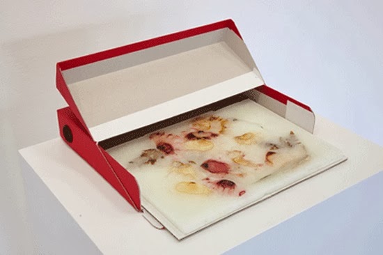
The exhibition must be popular because when I asked  for a leaflet in reception they said they had run out also I couldn't find any postcards of her work. I wanted to give a card to ma but there was nothing on sale just weird and disappointing. While hovering around the reception desk I noticed another work  which was outside of the exhibition area, literally on the reception desk by Marisa Mertz : a box filled with wax and flowers again a small intimate art work that could have gone un-noticed. 

I looked at it then wondered off into beautiful Hyde Park, great setting for a gallery (peaceful, quiet).

Sunday, 27 October 2013

Elmgreen & Dragset at the V&A in London.

As part of my Uni course with our tutor we went around London to view Galleries this time it was an exhibition at the V&A called Tomorrow by the Scandinavian duo Elmgreen & Dragset I didn't know what to expect as I have never seen their work and didn't know much about them either. As I had lost my group I found my way on my own to the section inside the museum where they where exhibiting actually when I got there I realised that it wasn't an exhibition but a spacial installation based on a fictional narrative in the 160-year old museum's former textile department that had been close for eight years, so it was exciting to see that the space had been used again and in an alternative way. It felt great to walk through the corridors of the museum looking at artifacts behind cases and find one self suddenly in The Tomorrow exhibition where one could touch items, sit or actually lie down on the bed it was interactive unlike the rest of the Museum. It's so interactive that while I was in the bedroom I actually pocked into what I thought was a sculpture but it was to my great surprise a person that screamed & then looked at me puzzled ( in my defence I can say that the lighting in the room was quite deem) he wasn't part of exhibit oh no he was a visitor like me.
                                
 The Tomorrow exhibition occupies 5 rooms in the form of an apartment obviously of someone wealthy from an upper class background this was given by the expensive furniture, items that I found in each room of the British architect Norman Swann who apparently never built anything. As a visitors we see his house as he is about to move out of it, in the  new Kitchen ( made by the new young tenant called Daniel Wilder, the architect student) I saw a lot of boxes used for packing items. The rooms made me think of old stately houses in England, there where real waiters going around the rooms making you feel in a different space and time where the upper classes lived. Elmgreen says that Tomorrow 'is a commentary on the disappearance old British society and a failure of the European experiment'. I didn't get this while being in the rooms, I would also add that the artist's view of what the old British society was in a particular time is narrow and they weren't there to experience the dominance of the upper classes also  they are from Scandinavian egalitarian countries, not really elite based, they might base themselves on documentation but it's really just fictional out of their own imagination.
 I felt uncomfortable as I felt none of it was real, a bit like mental masturbation. Some items in the rooms where there to give clues about the character of the person living in the house but he was fictional too a bit like being in a theatre setting which is made for the viewer to engage with the 'artwork' in a different way like you would do in a site specific situation so experiencing  it directly, it really can not be described. This is not a new concept but it is interesting the way they engage the audience & again the use of the space. This specific direct way of experiencing the installation makes you silent, looking for clues and stretches the time you spend inside the installation this is if you enjoy being in the space, if you enjoy being in an opulent surreal space if not you will be running for the door.
Some of the V&A objects can be found in the rooms and they will go back to the museum, but walking around the rooms looking at the items sitting down, I felt that the artists are interested in the fear of change about the future and the past: there are the old comfortable rooms in contrast with the metallic cold kitchen that indicates a new life has come in and how the future and the past connect with each other or not, about what one does with one life or not, it's about failure of fear of failure shown ( but I wouldn't go as far as saying it's a 'Western anxiety' like the artists said I think this is really stretching it) in one room with architectural projects which never saw the day light, in this sense the installation it's successful.

All Images By Elmgreen & Dragset at the V&A.

Friday, 11 October 2013

Mark Tobey the predecessor of Jackson Pollock.

Yesterday on a seriously rainy day I decided to go to the exhibition of Mark Tobey at the Thomas Williams Gallery in posh Old Bond Street in central London. It was my first time in the gallery which set on the first floor of the building, one had to ring a bell to get in. I did find the staff in the gallery friendly. Mark Tobey's work was well set up in one room. The work was mainly of a small scale: watercolours, tempera, mixed media from his late period the 1960's. I did find interesting the sizes of his work the variety of sizes especially for the watercolours which combined with the gentle use of colours in the work an air of intimacy, delicacy far remote from the stronger, vigorous work of Jackson Pollock. Yes because while I was observing Mark Tobey's work I noticed an 'all over 'painting style with no focal point, free of boundaries which later was central to Abstract Expressionism and the work of Jackson Pollock who was introduced to Tobey's work at the Willard Gallery in new York in 1944 but while Tobey's work is carefully constructed, calm & partly inspired by calligraphy Jackson Pollock's work was strong, the execution energetically almost violent and the scale of the work much bigger. Also I did find amusing that Mark Tobey's style actually came from the period he spent in England more specifically in 1931 at Dartington Hall in rural Devon owned by Leonard Elmhirst (who studied under the poet & social reformer Rabindranath Tagore) & his wife Dorothy, where he also met Henry Moore, Lucian Clement & Stephan Freud, Piet Mondrian. In 1935  while in Devon  Mark Tobey experienced an artistic breakthrough: he started a new way of painting called Broadway see below,
then was followed by Welcome Hero(1935) & a Broadway Norm(1935) in this last one there was no connection that could relate the painting to the title. In the exhibition  most  of his work did not have titles. For the first time in Broadway he used lines as a way to go beyond objects with a variety of combinations this was also present in the untitled works in the exhibition. One doesn't look at the lines to examine their intrinsic quality because they are freely combined  and unifying the object with the space around it in such away that you have to relate to the whole of the picture they are the first example of the 'bordeless'  picture or as Harold Rosenberg called them in 1952 ' an apocalyptic wallpaper'. One thing I always found curious about Mark Tobey is that he followed the Bahai faith so Tobey thought that each stroke of his brush maybe divinely directed I read some where that a portrait painter names Juliet Thompson introduced him to the Bahai' faith. Anyway one thing is for sure that from his work one can see that he was constantly searching for a freer way of painting, to be closer to nature and a strong influence of Chinese calligraphy. Chinese ink wash painting where also comes from the idea of a freely moving brush stroke he did actually travel to Shanghai in 1934 and then to Japan where he was not only absorbed by the culture, but he also discovered Japanese Zen Buddhism, Japanese ink painting and he studied Zen meditation in a Zen Buddhist monastery near Kyoto.
Most of the works in the exhibition are actually part of his late period: the 1960's where he was based in Basel Switzerland and are mainly watercolours, tempera & oil on paper with stronger colours, the use of red with a variety of forms and shapes from vertical brushstrokes Untitled 1964 to small dubs of painting Untiled 1970 in this period he also experimented with monotypes with no lines. I did find his work inspiring both in the concept, use of colours and the variety of sizes in his watercolours and the variety of types of paper he used which gave a completely different effect to his watercolours. I did find exciting that there where no figurative watercolours but they where all abstract and varied in their combinations it felt liberating after I have been to I don't how many figurative watercolour exhibitions in London. Below are the works of Mark Tobey which are on display at the Thomas Williams Gallery all untitled but from his later period the 1960's.


Friday, 13 September 2013

Gary Hume at Tate Britain

A Couple of weeks ago when it was quite inside Tate Britain I went and see Gary Hume's exhibition. Most people where visiting the other exhibition by LS Lawry who painted the masses, the working class in England during the Industrial Revolution. To enter the exhibition room I had to use the entrance doors created by himself called; How to paint a door which I thought was fun thought I didn't noticed them first when I went in as I was so spaced out ( I mean they are bright pink) I only notice them when I came out from the same entrance afterwards. 
How to Paint a door 2013 Gary Hume

Gary Hume explores emotional themes such as joy, melancholy, loss etc and he questions in his paintings the conventional notions of beauty sometimes combined a dark edge for example in paintings such as in Young Mother & Child 2002 & Beautiful 2001 where Michael Jackson's nostrils are combined with Kate Moss's face (can you see it?).
Young Mother & Child 2002 Gary Hume

Beautiful 2001 Gary Hume

I found his work in the exhibition to be over all visually pleasing & it made me think of illustrations, graphic work with simplified forms combined with contrasting colours general use of gloss paint not on canvas but on aluminium panels. Also one can not see brush work just smooth surface and sometimes he uses layers of thick paint like in the work The Whole World.
Blackbird 1998 Gary Hume

                                                      The Whole World 2011Gary Hume

Gary Hume uses imagery from reproductions in books and magazines he starts from a figurative drawing and then he abstracts his compositions for example in the work Orchid 2004 & Green Nicola 2003 where artist Nichola Tyson is changed abstracted into a rare flower again made with bold contrasting colours and face is dark.  He seemed to me that Gary Hume doesn't want you to know as a viewer what you are looking, what exactly is going on but at the same time he is not interested in narrative. Also his work show a fondness for flatness rather then perspective, less is more in his work.

Orchid 2004 Gary Hume

I did notice that he makes portraits of famous people which made me think he is well connected, he did study at Goldsmith University at the same time as other well know YBA's such as Hirst, Sarah Lucas, Matt Collishaw and his gloss painted doors where initially bought by Charles Saatchi. 
Again I did find fun, playful  the sculpture called: the Snowman (a childhood image perhaps) which yes you can imagine features a snowman but it's a bronze sculpture painted with enamel paint it seems Gary Hume put his own stamp on a traditional method; bronze and gave it an all together new life with the use of white enamel on top, the same as he did with the doors by painting them with household paint. I would have liked to have seen the sculpture outdoors.
The Snowman 2000 Gary Hume