Wednesday, 7 January 2015

David Hammons, White Cube, London. Civil Rights & The Black Power Movement!


This was a really exciting exhibition. In the first room upstairs there were the works made by Hammons using a basketball, these were 4 drawing using the same method against a piece of white paper. They are done on large pieces of paper; from afar they look like abstract minimalist landscapes; it’s just when you get closer that you realise that he has done the works  just by bouncing a basketball on the paper; the dirt and the dust go from the street via the ball to the white surface of the paper. 


His interest is in common, daily lives as opposed to the sterile unreal life of Institutional spaces; but with the association of Basketball with young African Americans, it also alludes to the place of African Americans in American society and the repetitive bouncing of the ball as a ritual. This specific work hints at arte Povera and American gestural abstraction. I have also been told by the gallery that behind the works the artist has put suitcases which give a sculptural dimension to the piece, one piece in particular looked like there was something behind it as it wasn’t straight, adding to the mystery of the piece or of what we can see and can’t see. For many African Americans basketball is a way out of the Ghetto but Hammons seems to say that this might just be an illusion given the way he titled the works: Traveling. The bouncing of the ball might take the African American so far, but the implication is that this is only a temporary solution. Traveling (2002), also evokes the rule of basketball that says you can't take the ball and run with it. But, could it also be hinting about belief in oneself, by bouncing the ball in the doing, instead of waiting for something to changed from outside by higher powers.


David Hammons is interested in common everyday objects and their implication in their use and also in their historical associations. In past exhibitions he has used: hair, wine bottles, his own body. His art is about movement, using a ball to make an artwork involves a movement; it is also about process and has an element of repetition as he has to continuously bounce the ball to get a pattern but it is also a freeing as he using a daily object in his life to make art. In the past I had seen his sculptural work such as Kick the Bucket 1988  & Untitled 1989 which was made out of  empty night train bottles put into a circular position of discontinued sequence on both sides, I would have liked to see this work again in the Gallery but I guess he is working on new things. Anyway the bottles allude to the fact that a drunk leaves just a trail of empty bottles, nothing else. His work is about the street. The objects, in this case empty bottles, still retain something or say something about who owned them. I find his work interesting because I also work with found objects from the street in my sculptures.


For example when he set himself up in1983 to sell different size snow balls on the sidewalk outside Cooper Union in 1983 after a Blizzard, people actually bought them, the artist didn’t set the price and the public bought the snowballs at whatever price, bypassing the gallery setting; it was done in the street and was easily accessible by anybody that passed by at that time. It questioned the objectification and commercialisation of art through art collecting, especially by the wealthy. It seems to me that Hammons is interested also in shaking up convention or what is seen as conventional. 


Downstairs for example in the White Cube Gallery are not paintings but rugs covering a canvas, a rug (tarpaulin & plastic) that could have been used to cover a  homeless person. His materials tell a story of the streets, this makes you think of the people living in the streets, or outside of society, there is tension between the painted surface underneath and the broken rugs lying on top of the canvas. It makes you think of a marginalised life, but also of how by putting the broken rugs centre stage they become like a ritual, they gain strength or a form of self-empowerment. He doesn’t have a dealer and has turned down offers of high profile shows, so seeing his work at White Cube makes it even more special. His work makes you question what can be seen and what cannot be seen as art. 


Also in the room downstairs on the actual stairs was a fur coat which stands for wealth;  this is covered in paint, basically vandalised but then again the artist by doing this gives it value, I personally found it to be a weak piece in the exhibition; I didn’t feel it added anything more to the rest in the main rooms. 


In the same space opposite the lift there was a tribal Mask; again I didn’t find this to be a strong piece either, see pic above.The Mask was entitled 'The New Black'.To understand it you need to know the fashion magazines; there has been a lot in the fashion magazines last year about orange being the new black.


I would have preferred to see his work using hair, dirty, daily objects etc. like Untitled 1990 which was made with metal coat racks, rubber, plastic bags, tin can and a found hat, or A Tribute to Martin Luther King, Jr, 1976, or the Indoor Hair Garden 1977. Over all in his work one can see also the influence of Marcel Duchamp and that of African American artist Noah Purifoy. He is interested in the circulation of goods outside of official economies which in a way resists being made part or included in an official language. In the 1970's and 80's he was at the centre of a group of black artists centred on the pioneering gallery Just Above Midtown. 


He is famous for his body prints made in the 1970s in which he covered himself with grease and pigment and then he used his own body to create marks on paper. He studied in Los Angeles at the Chouinard Art Institute and the Otis Art Institute before settling in New York in 1974. David Hammons was born in Springfield, Illinois in 1943.

Tuesday, 6 January 2015

Translation exhibition.


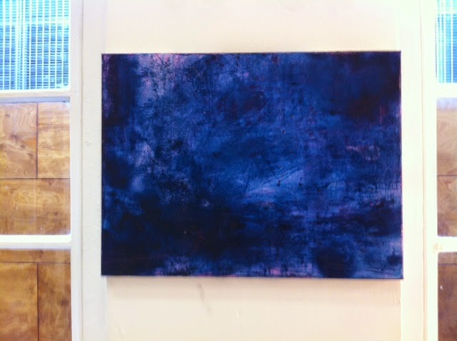
As part of the group exhibition for the first term titled: Translation I decided to put up a painting, as recently I have been working with oils and I decided to add a new element by adding sand to the painting and a translucent pink which gets affected by the change of light so with external light one would only see the blue of the painting while when the lights of the gallery are on one would see the pink tone of the painting. When I was making it I was thinking about when I was in Sardinia walking on the pink beach at night and suddenly we got hit by a storm that swept through. I liked the unpredictable element, not knowing what would happen but also remembering a good period in my life, when I was enjoying myself. At the moment I am definitely not going through a good period so it’s good to remind oneself of a place where one felt relaxed. A lot of people that saw the painting said that they found it relaxing even if it is about a storm.


At first I thought I was going to put it in the triangle space but then I tried and felt that my painting was getting lost among the largest pieces so I went back to the smaller Gallery and was looking around for a suitable space till I found one between the windows. I didn’t want to put my painting on the main wall; I wanted to do something different so I decided that it would fit perfectly between the windows and near the two works nearby which were quite colourful but different from mine. There were some interesting dynamics going on while setting up. Some students just wanted to set up with student friends of theirs, others just stuck their work in one place and never moved it, other students were discussing in groups how best show their work and kept changing the position of their work but they couldn’t do it entirely because some other students weren’t part of the game and didn’t want to move their work at all; a lot of students were just territorial and I think it was amazing that we were able to mount an exhibition at all. I was glad I found a spot that suited my painting and went well with the other works around it.


In this specific painting I was inspired by the exhibition by Turner that I saw at Tate Britain,by the way he painted storms, and his use of light. At the same time I was concerned with a much darker tone, in this case blue which cannot be read in one way, I tend to immerse myself in my painting and find dark blue deeply calming. Painting relaxes me as I have high anxiety levels and I find that when I am painting I forget everything. I can go back in time or recreate an alternate space where I can breathe, where I can have space, I don’t feel I have this in my daily life. Each painting I create has its own rhythm, space where I can be but the pink adds a hidden sparkle, maybe what am I saying with the painting is that underneath the darkness and the storm there is a light but the light is hidden - you have to look for it.


Pipilotti Rist - Hauser and Wirth in Saville Row London.


I have been focusing on my thesis lately, I haven’t had much time to blog, so I decided that if I went around to view some exhibitions it might give me the spark to start writing again on my blog. I have to say writing a thesis is like climbing a mountain; it is challenging to focus on other different writing on top of the thesis, lectures and producing work. I was walking around central London as a way to relax and by chance I found myself again at the Hauser and Wirth Gallery at the back of Bond Street; the current exhibition is by Pipilotti Rist, titled ‘Worry Will Vanish’. Inside the gallery I actually bumped into another art student in my course who is currently working with them, after having a chat with her I decided to plunge myself behind a dark curtain to see what was going on. I was asked to remove my shoes before going in. The exhibition is divided into two sections, the first section is in the entrance/reception; in the middle of it is a seating area where you can take off your shoes, opposite this is the branch of tree with a video with the artist free falling into space which I thought was great. I actually enjoyed this smaller piece better than the larger all enveloping projection. The second section is actually the main gallery, on the floors were large cushions and in front of me were two huge screens. The room was full of people lying down on the cushions, some were looking at the screens others were literally sleeping and one art student was sitting straight and taking notes. 


The Projection is based on three-dimensional animation and it’s a voyage inside the body; to tell you honestly  I didn’t realise it was three D animation -  that’s what it said in the leaflet, but to me some of the images were real and also mixed with computer generated design. On the screens images of nature and bodies were over-lapping, at one moment we were inside a nostril, at others we were in a field because the projection is so big you literally feel inside of it; all the images are done close up even of the artist herself naked; it felt new age and combined with calming music a bit trippy due to the image being so close up. Like a dance between what goes on inside and outside, images of nature and a connection to the Universe it was for a lot of viewers deeply relaxing. The Gallery Assistant did warn me that the videos might induce sleep, I told her not in my case there is no way I am going to fall asleep in here, I felt the room was to warm and I don’t really enjoy being in a dark room full of people with no air. 


The music accompanying the videos was by Anders Guggisberg and was very relaxing due to its repetitive mellow sounds. I wasn’t really surprised people were falling asleep. Pipilotti’s installation is supposed to be experienced by the audience, firstly by removing one shoes then by exploring the space inside. I was wondering what if I didn’t want to remove my shoes - would they let me into the exhibition/installation space? The removing of the shoes is for people apparently to release their social inhibition but I really didn’t feel I was releasing anything by taking off my shoes – I just felt rather uncomfortable. I kind of felt forced to do so and I didn’t like it. Because there are cushions on the floor basically you are as a viewer guided to experience the projection from a certain angle and in a certain way as you would be lying down. I felt this was manipulative but a lot of people really enjoyed the experience and the room was full, while I just wanted to make a run for the door. I was questioning the experience of lying down in a gallery looking at bodies and nature - yes it felt like being inside of a movie like when I went at the Imax to watch a Bond Movie, but I mean one can go outside and have this experience for real; at the same time the intertwining of texture, bodies, nature in the videos was excellent and the same goes for the music - you can tell she has been working in videos for a while as they are very well executed, they have pace, rhythm. 


The videos are based on auto genetic training to facilitate relaxation, developed in 1932 by the German psychiatrist Johannes Heinrich Schultz, (which would do in most people but not for me - I didn’t feel relaxed at all) so that the viewer is receptive to new ideas. While I felt that I was pushed to behave and feel in a certain way most people wouldn’t mind this if is to bring relaxation, they will go happily along with it and enjoy it. Anyway I didn’t stay long so I went back to the reception where there was a small video installation entitled Stone Skyscraper (2014). I always like to check where an artist has studied and in her case she studied at the University of Applied Arts in Vienna and at the School of Design in Basel. I found her videos interesting and inspiring I wish I could do more videos at University or be taught video making at University. Below is Stone Skyscraper: a miniaturised Skyscraper carved from sandstone with a video projected on the surface, colour is a strong feature in her work.


Friday, 31 October 2014

Phyllida Barlow at Tate Britain. Excellent exhibition.


When I had some time to kill between lectures I went to the Tate Britain to see the new sculptural installation (commissioned work) called 'Deck' by the British artist Phyllida Barlow, located in the Duveen galleries and loosely inspired by the view from Tate Britain Milbank of barges floating in the Thames.
 
 The work is in stark contrast to the newly refurbished galleries and staircase which look really composed, elegant, neo classical. Phyllida Barlow's work is massive, chaotic, in all possible ways. I could walk through it and around it. It is an anti monument made out of every day ordinary materials such as cardboard, polystyrene, foam, colourful tape, wood (timber), a combination of texture and colour, scrap materials that have not been used for years, that one would not associate with a monument - these are used to make stilted giant towers, with cardboard which doesn't sit perfectly straight, the jumbled pieces of wood stuck one on top of the other, going in different directions - these bring a sense of chaos to the whole section.  It is in your face and you can't avoid the work as it is so large and imposing, there is no refinement to it, it is blatantly crude.
She says: 'The idea to begin with was incredibly simple: to plant into the Duveen a new structure that counteracted the reverent, vaulted space, and its almost religious connotations, and introduce an almost basic geometry'. Barlow with these colossal architectural structures made out of ordinary materials (some are built like scaffoldings), is referring to industrial structures, containers, while at the same time referring to the history of sculpture very present in the other rooms of Tate Britain.
 
 
The first piece is made out of five large blocks,  the size of a shipping container, with orange and black cords; everything is mangled, nothing is straight or precise, nor precious. I am not allowed to touch anything, though, and I really feel like touching the mad tower made out of cardboard and colourful tape similar in height to the other pillars in the gallery. It is a funny joke about the straight classical, past monuments made by men; nothing is certain in her installation, her column is not perfectly straight but is made out of crumbled cardboard and it's got colour around it in total opposition to the seriousness and self importance of past monuments; but the work is huge like past and current male artists love to make. In one way it's great that a woman artist  is commissioned to do such giant work, on the other hand why does a woman artist need to do big work as a male artist? This is my own general question: do women artists need to play like their male counterpart artists in order to be recognised? The large scale sculptures are excellent; while walking through them just the sheer size of them, going up to the roof and down to the floor, brought me mentally back to the past and to large scale monuments, architectural works, and to question their validity and place in society. Also by whom they where chosen and for whom? Especially considering that women were not included generally in monuments and did not participate in the making of monuments in the past, so in this context I find Phyllida Barlow's sculptural installation excellent and feminist, and I looked at in comparison to past monuments made by men for men and in comparison to Tate Britain which was built by masculine authority. (Nowadays, however, Tate Britain does show plenty of work by women artists, more so than other galleries.) The sum of her works stands in comparison to Tate Britain's solid structure, a skeleton, a dystopian view, with the look of ruins. The work is about assembling, storing, arrangement, the material is predominant and is right in your face. There is no single viewpoint for the work so the viewer is forced to move around, across and under the work.
Barlow's work also refers to arte povera, minimalism, and to British sculpture of the past.
 

 Yes, everybody can enjoy the sculptural installation and the simple ordinary materials, combined with coloured tape these make you think of a child playing, assembling; there is nothing high tech in place apart from the way it's assembled that I am sure required a specialist team. Barlow said: “I love the cliché that a child could do it. Yes, a child could do it, but when you’re an adult, you’re doing it for real, either because there’s some OCD condition where you’re a hoarder, or for practical reasons, or you shift a bit further over and it’s in a museum of art''.  Through her work she questions the fundamental aspects of sculpture, its presence in space and its physicality, a combination of softness and hardness.


Phyllida Barlow was a teacher at the Slade School of Fine Art; her students included Angela de la Cruz and Rachel Whiteread; she was a strong influence on a young generation of artists. Previously she studied at the Chelsea School of Arts (1960-63) and later at the Slade School of Art (1963-66) where she trained conventionally in sculpture and in techniques such as metal casting, armature construction, plaster modelling etc. I find this interesting as nowadays in art colleges across the UK there is no conventional teaching (apart from theory), or practical classes.
I went to her exhibition because I work with found, scrap materials in my own sculptures and was interested in how she used those materials and also because in my own work I aim to create something different.

,

Sunday, 26 October 2014

Shelagh Wakely at the Camden Arts Centre.

The Camden Arts Centre
At the Camden Arts Centre they usually have good exhibitions on and they're free; I can't actually remember if they have ever had a bad exhibition! I arrived at the exhibition from walking on a very busy, full-of-heavy-traffic street, the Finchley Road - I wished that I had gone up to Hampstead station on the northern line and walked down through the charming and quieter streets of Hampstead to get there. At the Camden Arts Centre they show emerging artists, international artists, and more established better-known artists and they run a residency programme to help artists develop in their practice. They combine this with educational activities, public events, talks, film screenings, art performances and family activities. The Camden Arts Centre is a Grade II listed building and an Arts Council art centre; it was refurbished in 2004.
The Director, since 1990, of the Camden Arts Centre is Jenny Lomax OBE. In the 1970's she worked at the Whitechapel Gallery as part of a curatorial team set up by Nicholas Serota. This time I saw the exhibition by British artist Shelagh Wakely (1932-2011) which expanded from the Gallery into the garden and included ceramics, unfired clay sculptures, prints, videos, and drawings.
I did find interesting that she lived abroad a lot. She spent most of her youth in Kenya and later on in Brazil. She studied at the Chelsea College of Arts (1958-1962) and she worked as a textile and clothing designer in the 1960's; all of these different elements in her life are present in her work.


In gallery 3 on the floor there is a gilded black silk sheet (pic above), slashed with a knife, and the gold side of the piece reflects ambient light and should cover the room in a shimmering pool of gold, this would turn the art work into an installation piece; but I didn't experience or see this because it was a grey day so I could only observe the piece on the floor without the whole room being suffused with light.

In the room there are two gold trolleys with wilted fruit but in one trolley the fruits looked fresher than those in the other; the gallery assistant explained to me that this was because they had been made by the gallery assistants while the older fruits actually were found in Shelagh Wakely's studio. I have to admit I preferred the older looking ones - they made me think of a ghost in a room: the fruits looked greyish and lacked the golden vibrancy of the other fruits, they are like a negative. There are also organic pieces, such as tangerines, grapefruit, aubergines which are left to rot and are gilded - some are covered in gold to look wrinkled and dried.... it's about the passage of time, it reminds you how things were, vital and full of life but now they are dead.

In the middle room inside a case there is a necklace made from a string of cherries and fruits, imprisoned inside a cage of fine wire jewellery. Here again the fruits are wilted, they have been left to rot, the combination of these elements gives the piece a sense of fragility, of the passing of time, something vital has been turned  into a skeleton.


In Gallery 2 on the floor I saw a giant swirling pattern of turmeric made out of cut-outs, stencils not easy to make, as they are done in blocks to make them look like an uninterrupted piece, the turmeric with the light would cover the whole room in yellow but again I didn't experience this or see it because it was a grey day outside. I couldn't smell the turmeric either so I didn't experience the installation side of the art work, and can't say like others have said that her work goes beyond boundaries, that it floods all spaces. Nor can I say that her work involves all the senses as I wasn't allowed to touch anything due to the fragility of the pieces, but I was also told by the galleries assistant that they had worked with kids reproducing some of the pieces in the exhibition, which is great!


 In the garden there is another work of Shelagh Wakely's. I felt that the garden was actually the weakest link in the exhibition as the squares laid out there would have been better shown on a dark surface, as presented in the gallery leaflet, rather than on grass. The colour of the bright green grass was overwhelming the piece and it distracted me from focusing on the actual work of the piece and in particular the delicacy of the small pieces of silver inside was overwhelmed by the green grass. The piece stands out more on a dark surface - check pic below.


In the Garden are also works by Susan Hiller (with sounds - this was the one I liked best!) and  Alison Wilding and Richard Deacon. Another area in the garden is also dedicated to plants with  medicinal properties such as chervil, anise, angelica etc.. this is based on Wakely's own garden in North London and also inspired by a commission that Wakely did for St Geroge's hospital in Tooting, which shows her love of nature.
Lastly in one of the rooms were large drawings, doodles of bowls that turn into something quite different, concave or abstract shapes, where colour is minimally used with splashes of blues and reds predominant; some of the drawings could be considered negatives or between positive and negative, a transitory face due to their indefinite structure. There are also films in the show in which one could see Shelagh Wakely working outdoors, leaving her work to be affected by the weather and it was interesting to watch how this changed the actual pieces.


Thursday, 25 September 2014

Pierre Huyghe at Hauser & Wirth in Saville Row London.


Even though I have been very busy I managed to see another exhibition in central London, by French artist Pierre Huyghe at the Hauser & Writh Gallery in Saville Row London called 'In Border Deep'. At first I thought the gallery was shut because it looked completely blacked out from the outside; I pushed their main door anyway to find out they were actually open but blacked out for the exhibition for which they are keeping three aquariums in the main gallery. Some had fish inside with lights that switched on and off. I was a bit concerned for the welfare of the fish because in one particular acquarium the light kept flicking but also because the acquarium looked dirty, but maybe it's ok I am no specialist in aquariums. The aquariums are positioned on the left hand side of the Gallery next to each other while next to them on the right was a film showing and at the back another film was showing but in the sections of the aquarium there was also what looked like a red painting going across the room and in front of it a stone sitting on top of sand. I mean it was quite dark in the gallery so I couldn't see it that clearly because the whole Gallery was blacked out; I felt like I was inside an underworld. The way the works were set out in the gallery was coherent as there was space between them and it worked well with the films been positioned on the right and at the back of the gallery. 
 
Pic taken of the aquariums when lights inside the Gallery were on.
Apparently the three aquariums contain biotopes from Monet's ponds in Giverny but I didn't see any water lilies floating on the surface of Huygh's ponds and one is supposed to see them. Strange. Inside the aquariums are supposedly sunken man-made objects that have been modified over time by the erosion of the water, I guess, natural elements. But I didn't see any. The lighting sequence  is programmed to a fast-paced rendering of the variations in weather conditions as recorded at Giverny between 1914-1918, when Monet painted the 'Nympheas' which are in the Musee de l'Orangerie. The light sequences for each aquarium follow the shortest day of the year in 1914, the autumn of 1917, and the entire four year period. I wouldn't have known any of this if the Gallery assistant (who was very nice) hadn't told me. I did notice the lights timings were different as one was flickering but I have to say the flickering was bothering me and I was wondering how would it affect the fish? So I focused more on the aquarium with a slower pace of light. Looking at aquariums is reported to lower your heart-beat.
 
 
In front of three aquariums  I saw a reclining figure, a concrete cast, a headless sculpture which looked covered in moss (above). I was told again by the gallery assistant that inside of it there was a heating device that encouraged the growth of vegetation, and apparently I was supposed to notice that the sculpture  was 'emanating a body temperature' like a human body. I failed to notice any of this and if I hadn't asked the gallery assistant or read the Gallery leaflet I don't think in the dark room I would have noticed anything at all. At least it was coherent with the 'theme' of the exhibition. It represents an anti monument as it is not fixed and is continuously evolving.
 
Film De-extinction 2014
Going on to the two films, the first I watched was  the one at the back of the Gallery which was apparently the starting point in the exhibition ( I went to the fish tanks first because they were closer to the main entrance) where Huyghe uses microscopic and macroscopic motion-controlled cameras to record insects encased in amber. Actually they are done so close up that sometimes it looks blurred to the point that could look like moving paintings. I did find it really relaxing to watch, they are slow moving, combined with the soundrack similar to a mechanical shuttle which I didn't hear very well, indeed at points I thought it was soundless. I think actual music would have added to the piece. Anyway, the film is done in consecutive close up frames where Huyghe explores the idea of 'an instant frozen in time'.
 
Film The Human Mask 2014
The other film titled: 'Human Mask' is a dystopian setting where an animal acts out the human condition; the animal is trapped; apparently this is inspired by a real monkey in Japan that has to wear the mask of a young woman and has been trained to be a waitress; I mean really weird.. it has a dark undertone. At the back of the aquariums I saw a stone on the floor which for Huyghe marks 'the origin of man and the development of rudimentary engineering'. Really?  Above is a work called 'the Clearing' apparently made from sanded down layers of paint from the wall's surface exploring the wall as a body, as something alive, what is left of human remains.... again I didn't notice this due to the room being dark.
 
 
I saw what looked like a painting on a wall (above on the left hand-side) and only found out about it because I read the Gallery leaflet. Anyway it combines with the rest of the work with the overall theme of the exhibition. Because the whole gallery was blacked out and by the way the works were positioned in the Gallery I felt like I was in an enclosed space, a cocoon in which one could walk around the gallery in a circular way surrounded by living organisms. This shows that the artist is interested in growth and change as the aquariums and the sculpture are living organisms that constantly grow and change so that the gallery becomes a container where new events and encounters take place, but in conditions and context that are imposed by the artist. Each aquarium for example is a mini theatre with the fish being the performers. Huyghe said in interviews that ' you throw a piece of banana in a compost and there will be a metabolisation. It's not that the banana disappears, but it will do something else? It will achieve a different intensity of being a banana. That's what I am interested in, this banana-ness and this variation of intensity and how things leak into each other'. So he is not interested in the end but more in the transition, he constructs a play.The live elements, like for example the fish inside the aquariums, can create something umpredictable and in doing so change the rhythm of the work so the work itself is continuously changing which will affect the time and space and will help to draw in the viewer, It sent me into a meditative state in some ways; anyway it was a consistent, interesting exhibition with elements of surprise and darkness.


Sunday, 21 September 2014

Adriano Costa at Sadie Coles Gallery, London.

I haven't been blogging since June. I just had the worst summer. I decided that if I want to get back in my University course I have really got to start again blogging.  I have been thinking... how can I do the last year at University if I can't even concentrate on basic things? So I thought if at least I can start back on my blog maybe later I can start working back on my thesis again; so here I am. The first exhibition I got to see is the one by Brazilian artist Adriano Costa (BA Universidade de Sao Paolo) at Sadie Coles Gallery, titled: Touch me I am Geometrically Sensitive. It was the first time I went in the Sadie Coles Gallery in Kingly Street which is at the back of Carnaby street, in a street full of restaurants and bars, very centrally located. From inside the gallery one can see busy Regent Street; it is easy to get to. Inside the exhibition space most of Costa's work is shown together in one large room; the works are closely displayed so that you really can't focus long on one particular work.


His work was made over a period of two months while he was staying in London which was to lead to the exhibition, and using all sorts of objects that he could find around from rugs to bricks, but I feel that some of the objects he chose were not just found but purchased especially in one particular piece called Bartira/Suggestion for Furniture - here the ladders looked brand new and also in Untitled, which undermines a bit of the spontaneous concept implied by the Gallery in their leaflet  and by most art critics: 'mostly gathered in situ - harness of everyday daily objects', yes he does use some daily objects but it is not spontaneous work, it is thought through and is not entirely whatever was to hand for inspiration. I would say Adriano Costa is also a 'conceptual/referential artist': he reminded me of Brazilian modernist Helio Oiticica in his use of plants and wood and in the tea towel tapestry, and there is also reference in his work to Carl Andre'.


Overall the room looks busy and messy because all the works are so closely put together so I didn't feel I could focus much on one piece. He combines a different range of forms, materials (mainly industrial), and colours but the colours are not really dominant in his work, form and materials and geometrical shape have priority in his work.
Some works are bigger in scale than others, some are suspended while others are more earth bound.In some of his work, by using common materials and being playful with their combination like putting foam inside Perspex, suspending socks for example, he is showing how a supposedly uninteresting material can be made into art, but this is not a new idea it has been done before. Even if the work is playful I really didn't feel it was 'art of the incidental' like the Gallery states, it is not at all, it is well thought out one can see this by the way the work is positioned in the space. There are paintings made into geometrical patterns; some work better then others but I didn't feel they added anything to the rest or added anything new to what has been done before by other artists. I felt they were the weak link in the exhibition;


I mean they were really average, like the squares on a board, and the artwork called Norwegian Cheese (pic. above), they didn't add much to the other pieces; also the newspaper cut out and frames with some of the things happening during his stay in London in the news added nothing more to the exhibition.  What's the point of this? Is he trying to say that a lot of contemporary art is useless? Which seems to me the opposite of what he says in his other work. He said that he used the newspaper cut-outs to understand the country he is living in, which I find odd. I don't think you can really understand a country by only living in it for two months and cutting things out from a newspaper and then by framing them he is saying anything can be art and he is making fun of the art world, despite showing his work in a major art gallery. But the rough newspaper cut outs and the dark smartly polished frame didn't really go together and he has made a point in previous exhibitions of not using frames or pedestals as part of his work as he said in interviews, so what he is doing now is not consistent with what he has done before.
He  did use some recycled materials, polythene bags recycled from different London Boroughs so basically using them in a different way. What I do question is the fact that the way he uses the materials is not really ground breaking and has been done before by other British artists. Why is a major British gallery asking a Brasilian artist to do work about London instead of showing hs work about Brasil which is better?!
There are a lot of artists in London in British Universities working on similar concepts in very innovative and interesting ways but they don't seem to be taken by some major British Galleries, there are hardly any major galleries going around universities in London to see what is available; they seem to prefer taking artists from the USA and Germany mainly or from other countries. So I really do feel bad about a lot of English students that are paying £9000 per year with poor studio space who don't have access to studio space outside of University because they can't afford the high fees in London and on top of that galleries don't even look at their work or promote them, and there are hardly any scholarsips or sponsorships for art students but they are getting charged the same as students of other faculties who don't have to spend money on art materials.
And they have to compete also with a lot of other artists from Europe who don't pay the £9000 per year fees but only up to £1800 and they have to compete with Scottish students who pay only £1800 per year. I think English art students are currently really badly treated in their own country which opens the door to another argument: that of the politics in the art world on how they choose artists.  I am amazed by the dedication of a lot of British art students at my University who work hard to achieve the best in really difficult financial circumstances.